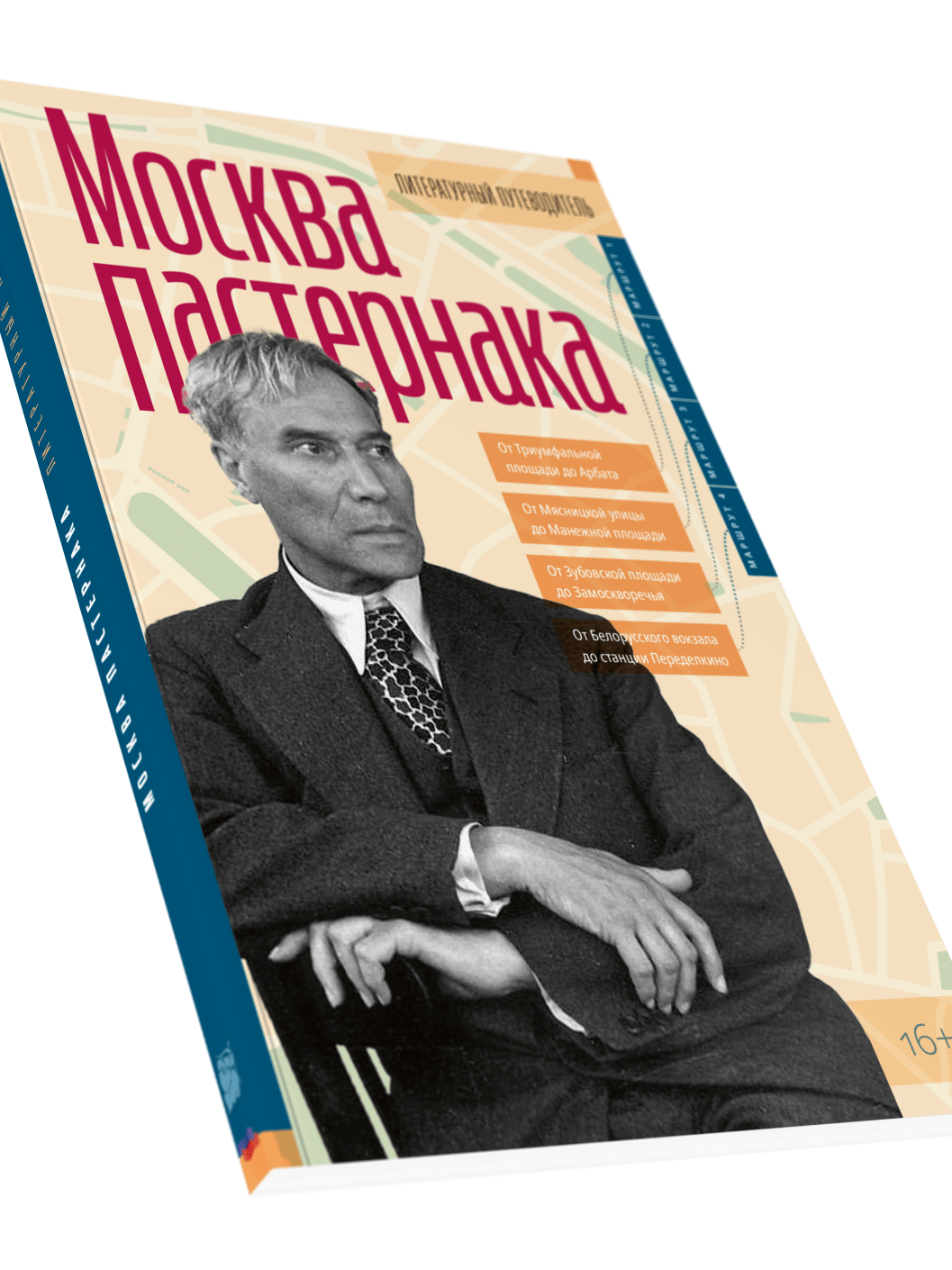
Pasternak's Moscow
Design and layout for Pasternak's Moscow - a literary walking guide to the city through the life and work of Boris Pasternak. Four routes, archive photography, maps, and a cover that blends a period portrait with a schematic city plan. Full design from scratch: cover concept, typographic system, and interior layout.


Feeding the Dragon
Full design and layout for Feeding the Dragon, a Chinese cuisine book by Andrew Kirillov. Developed from raw materials - a Word file and unedited photographs - to a complete, print-ready book. Includes cover design, typographic system, photo editing, and interior layout.
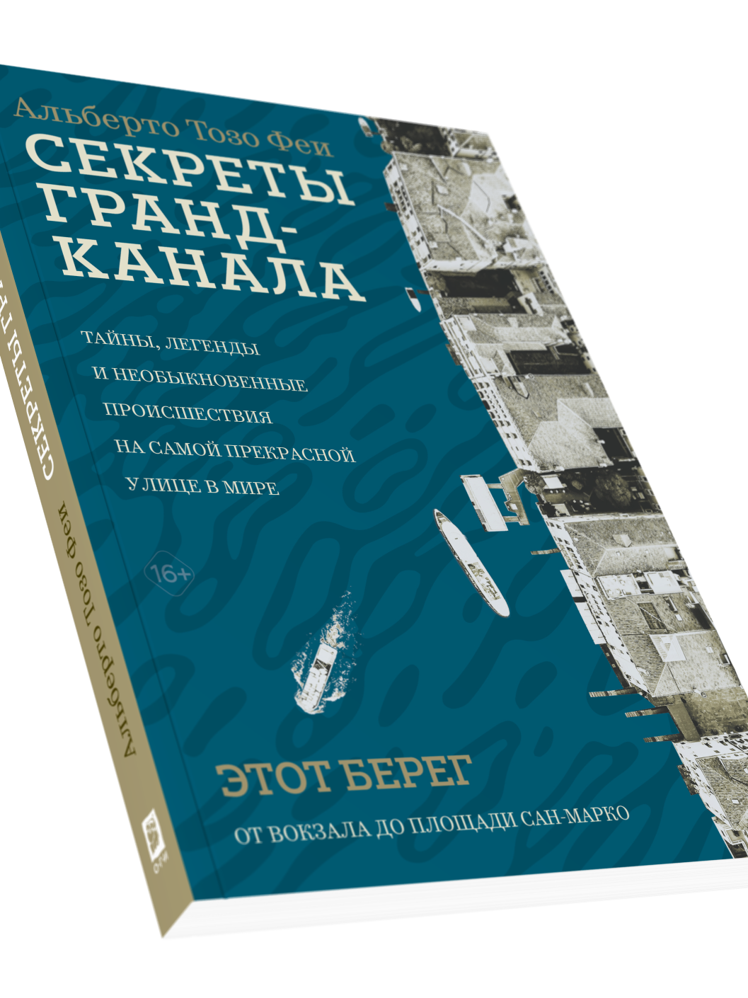
The Secrets of the Grand Canal
Design and layout for The Secrets of the Grand Canal by Alberto Toso Fei - a Russian edition of the 2024 Italian original. A dos-à-dos binding: two books in one, each starting from its own cover - "This Bank" and "The Other Bank." The interior design follows the visual language of the Italian edition while being substantially reworked for the Russian publication.
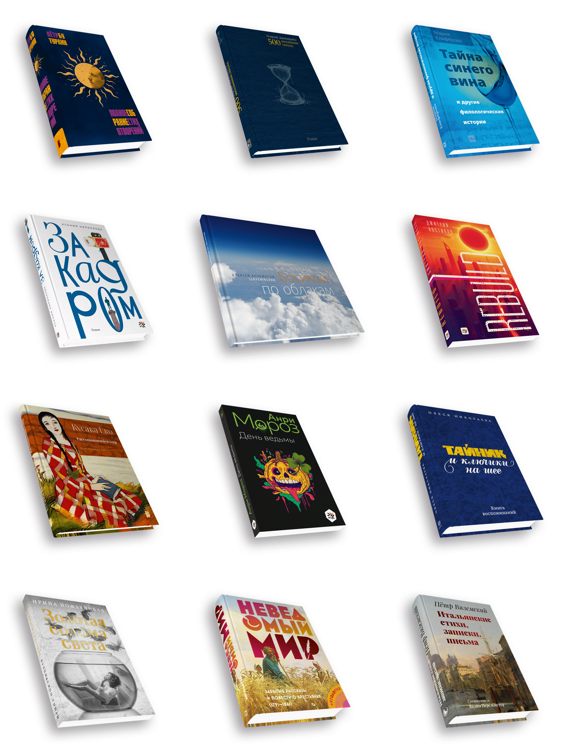
Selected Book Covers
A selection of book covers designed across recent years - poetry, prose, scholarly editions, and memoirs for various publishers. Each project approached on its own terms: different typography, imagery, and visual language depending on the content, audience, and publisher's identity.
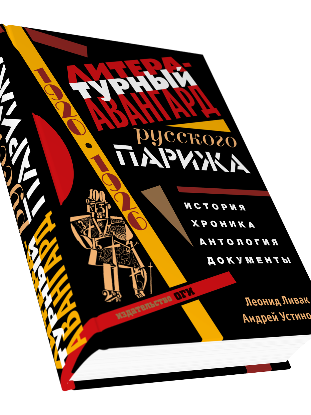
The Literary Avant-Garde of Russian Paris
Design and layout for The Literary Avant-Garde of Russian Paris (1920-1926) by Leonid Livak and Andrei Ustinov - a scholarly volume combining history, chronicle, anthology, and documents. Nearly 1000 pages with almost 400 illustrations.
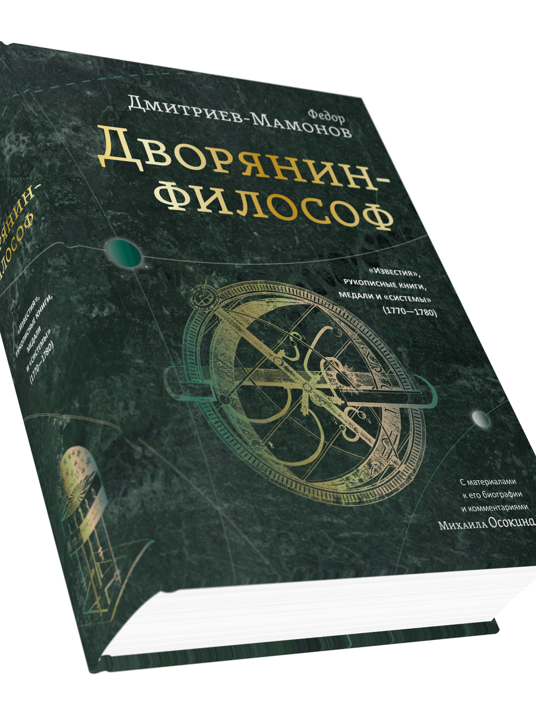
The Nobleman Philosopher
Design and layout for The Nobleman Philosopher - a scholarly edition of writings by 18th-century Russian thinker Fyodor Dmitriev-Mamonov, with biographical materials and commentary by Mikhail Osokin. No photography, no color - just typography, a 1200-page layout, and a graphic system built around the author's astronomical ideas.
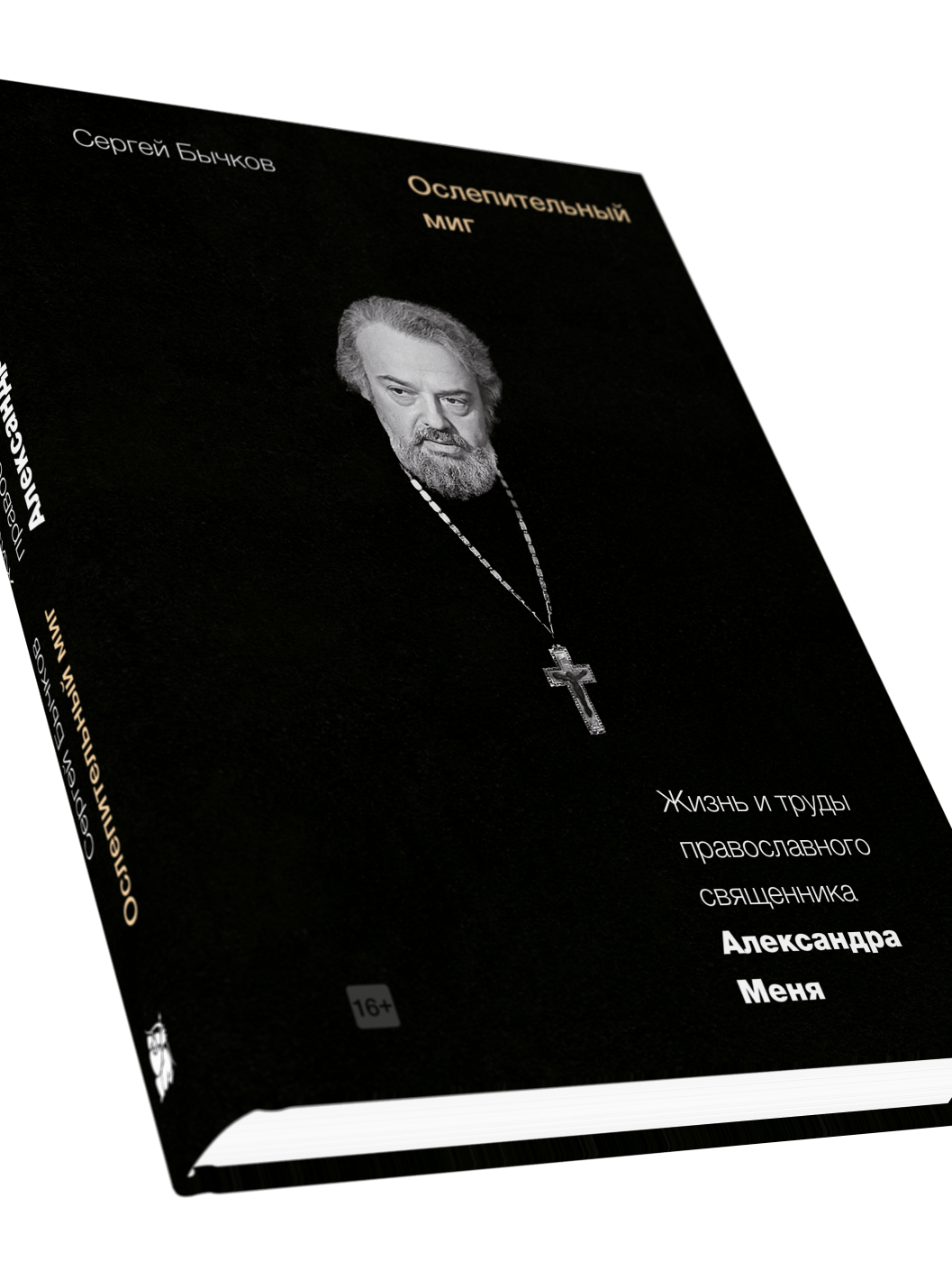
The Dazzling Moment
Design and layout for The Dazzling Moment by Sergei Bychkov - a documentary biography of Orthodox priest Alexander Men. Black cover with a full-bleed portrait photograph, restrained sans-serif typography, and a clean interior built around archive photography and running text.
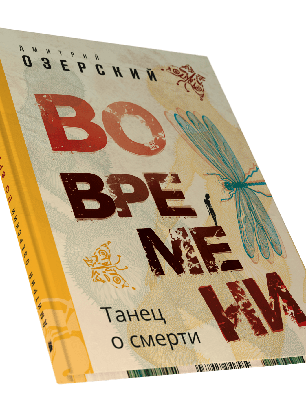
In Time
Design and layout for In Time: A Dance About Death - a poetry collection by Dmitry Ozersky, illustrated by a group of artists including both human illustrators and AI image generators. Each poem has its own illustration in a distinct style. The cover mixes distressed display type with hand-drawn and digital imagery; the interior carries the same raw, eclectic energy throughout.

The Light of Inspiration - Evgenia Kunina
Design and layout for The Light of Inspiration - a collected works of Evgenia Kunina (1898-1997), a poet largely unpublished during the Soviet era. The cover combines a 1936 portrait painting with a geometric bird illustration in teal and terracotta. A serif interior with full-bleed archive portrait spreads.
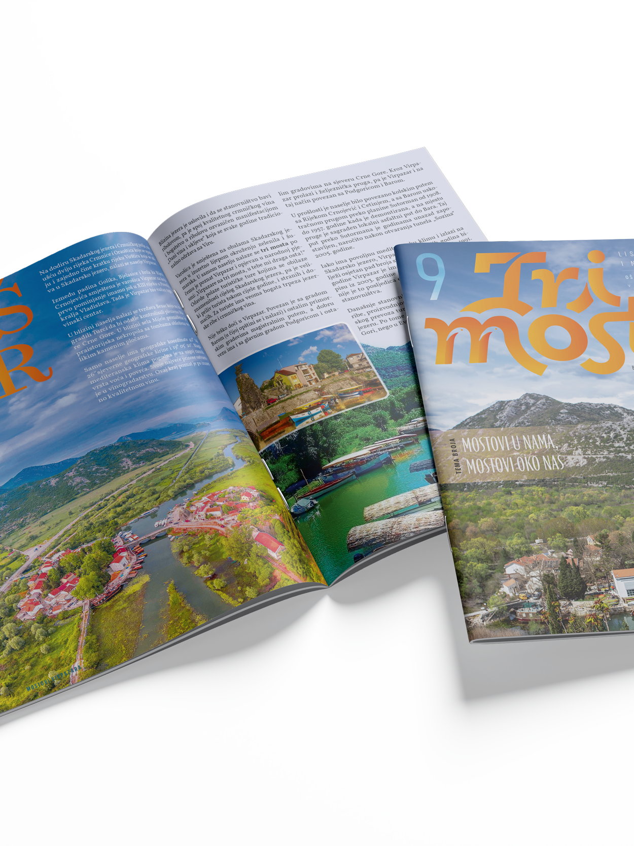
Tri Mosta Magazine
Design and layout for Tri Mosta - a student and teacher magazine from OŠ "Jovan Tomašević", a small rural school in Virpazar, Montenegro. A fully handcrafted project: cover design, typographic system, photo editing, and interior layout, done issue by issue from scratch.
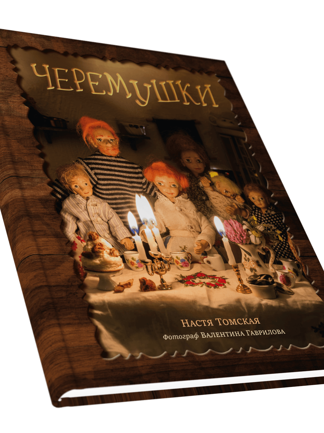
Cheremushki
Design and layout for Cheremushki by Nastya Tomskaya - a children's book of seventeen linked stories about a tiny people living under fruit trees. The illustrations are photographs of a doll's house built specially for the book, so the layout is built around rich full-bleed imagery, with a custom display typeface for titles. Photography by Valentina Gavrilova.
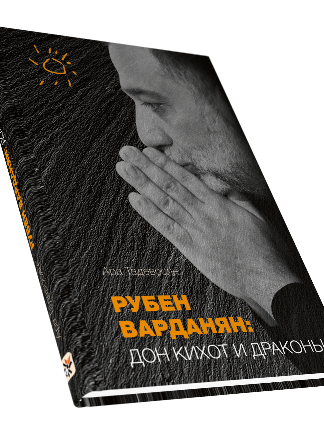
Ruben Vardanyan: Don Quixote and Dragons
Design and layout for Ruben Vardanyan: Don Quixote and Dragons by Ara Tadevosyan - a documentary portrait of the Armenian entrepreneur and philanthropist. Black cover with high-contrast photography, orange accent type, and an editorial interior built around archive photography and bold vertical chapter titles.
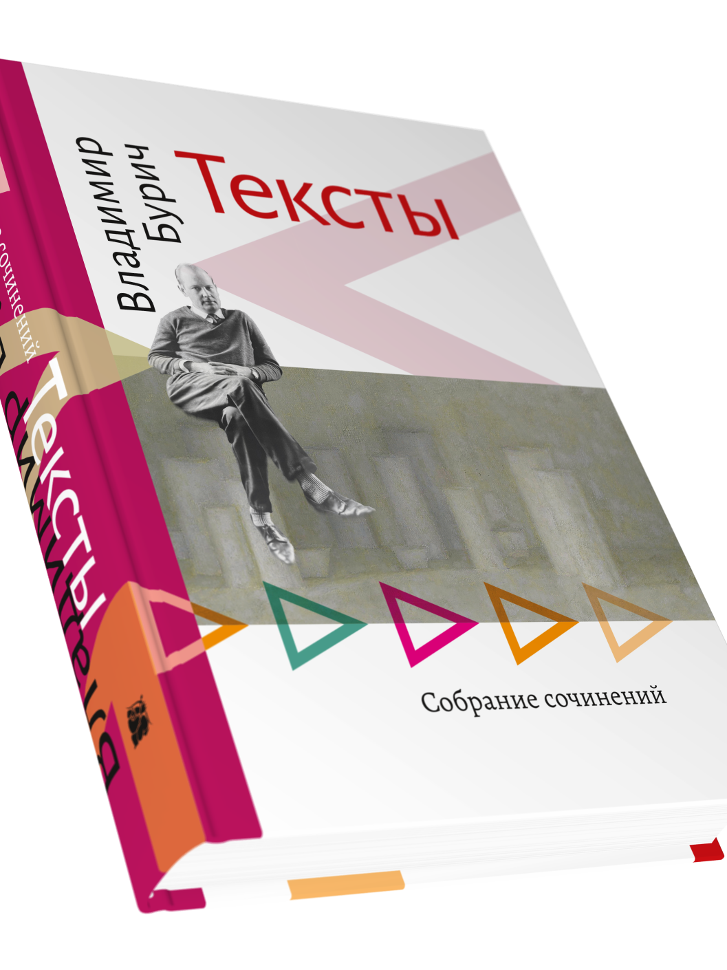
Texts - a collected works of Vladimir Burich
Design and layout for Texts - a collected works of Vladimir Burich, Russian free verse poet and theorist. Colorful geometric cover with archive photography, clean sans-serif interior with full-bleed portrait spreads. Cover design incorporates a fragment of a painting by Vladimir Veisberg.
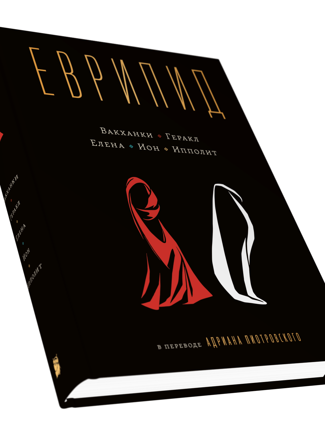
Euripides
Design and layout for Euripides - five tragedies in the translation of Adrian Piotrovsky, published for the first time from archive manuscripts. A stark black cover with a custom figure illustration, spaced-out display type, and a clean typographic interior.
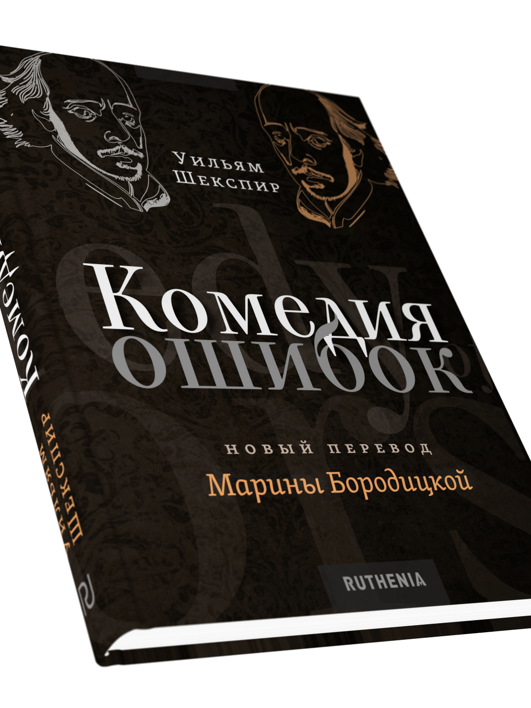
The Comedy of Errors
Design and layout for The Comedy of Errors - a new Russian translation of Shakespeare's play by Marina Boroditskaya. Russian translation first, original English text following. Dark ornamental cover with engraving-style portrait illustrations and a clean serif interior with typographic title spreads.
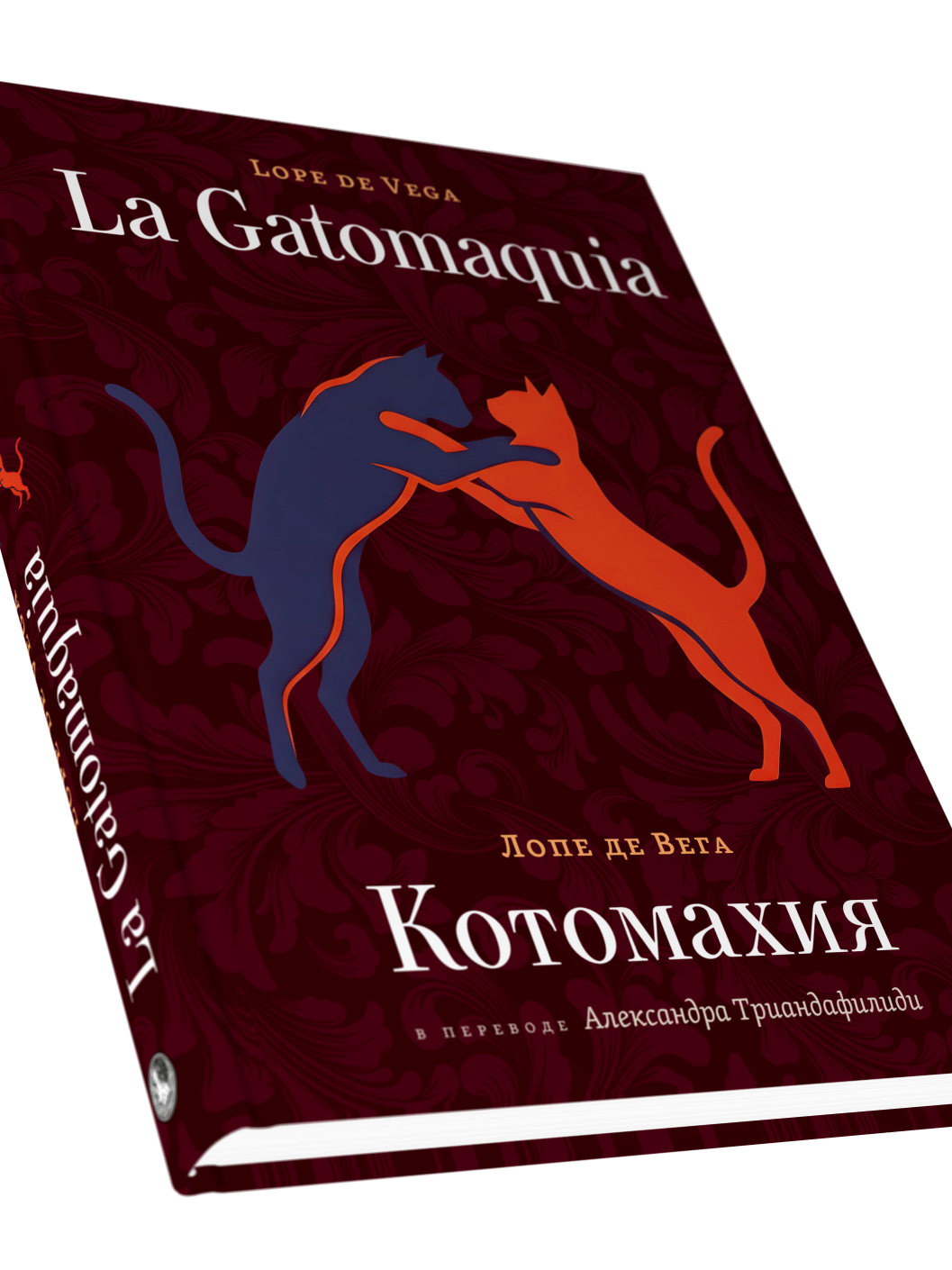
La Gatomaquia
Design and layout for La Gatomaquia / Котомахия by Lope de Vega - the first complete verse translation of this 17th-century mock-heroic poem into Russian, by Alexander Triandafilidi. A bilingual edition with Spanish and Russian running in parallel throughout. Clean serif typography on white, with a deep crimson cover built around a custom cat silhouette illustration.
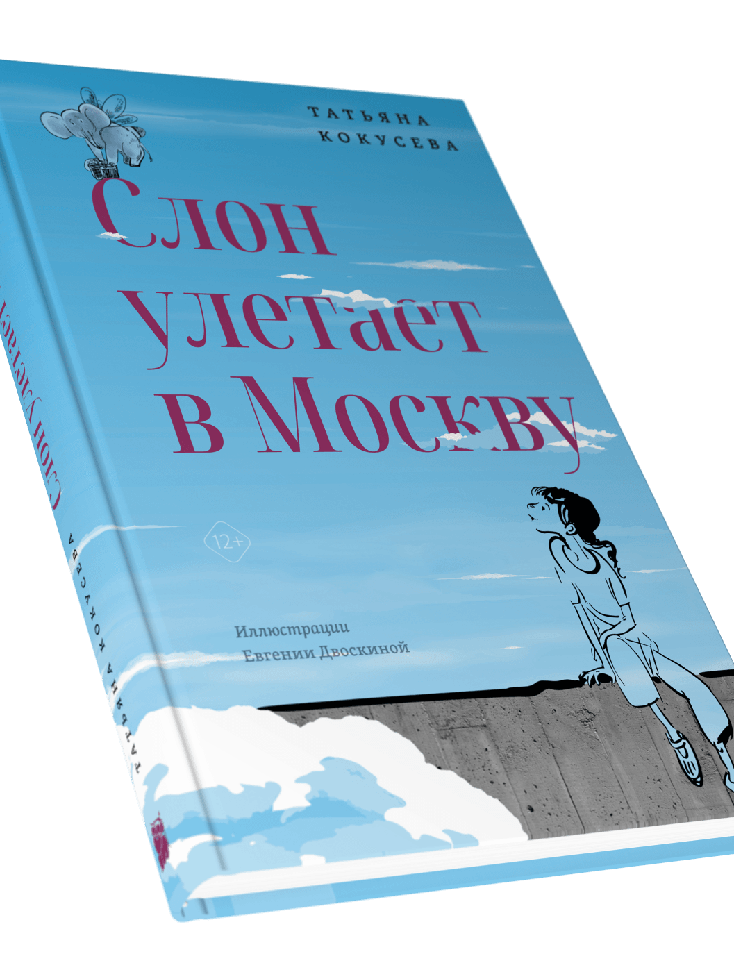
An Elephant Flies to Moscow
Design and layout for An Elephant Flies to Moscow by Tatyana Kokuseva - a debut YA novel with illustrations by Evgenia Dvoskina. The interior is built around her ink drawings: airy white pages, generous spacing, and a typographic system that steps aside and lets the illustrations breathe.
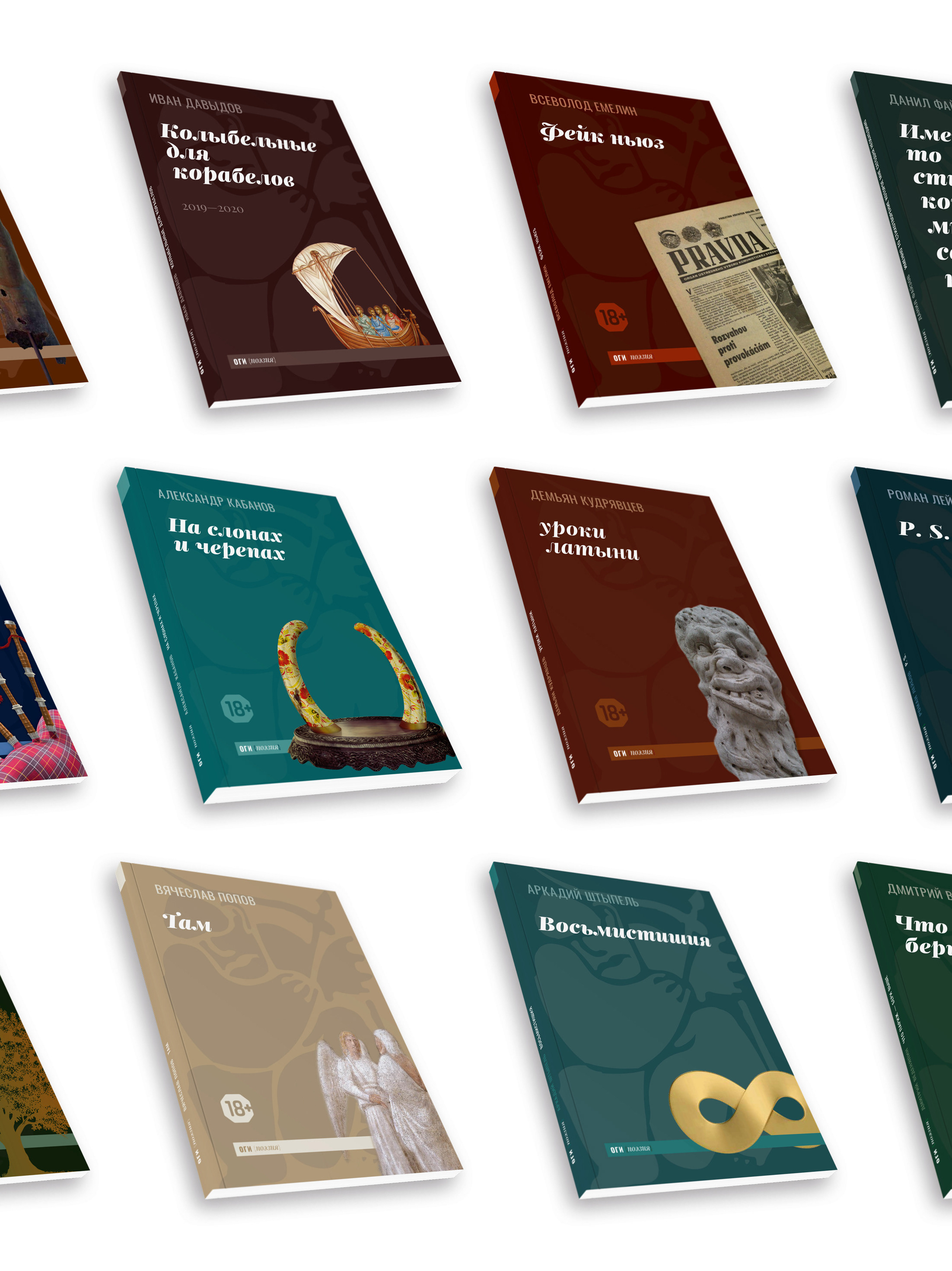
OGI Poetry
Cover and interior design for an ongoing poetry series published by OGI. Each title gets its own color and cover image within a shared typographic identity - same grid, type system, and interior layout throughout.
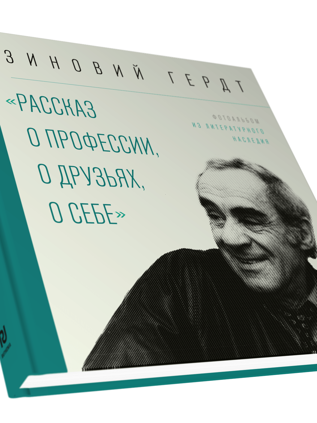
Zinovy Gerdt
Design and layout for Zinovy Gerdt: "A Story About the Profession, About Friends, About Myself" - a photo album and collection of literary materials about the actor Zinovy Gerdt. Built around archive photography from his personal collection, much of it published for the first time. A square format with a clean serif interior that lets the black-and-white photographs lead.
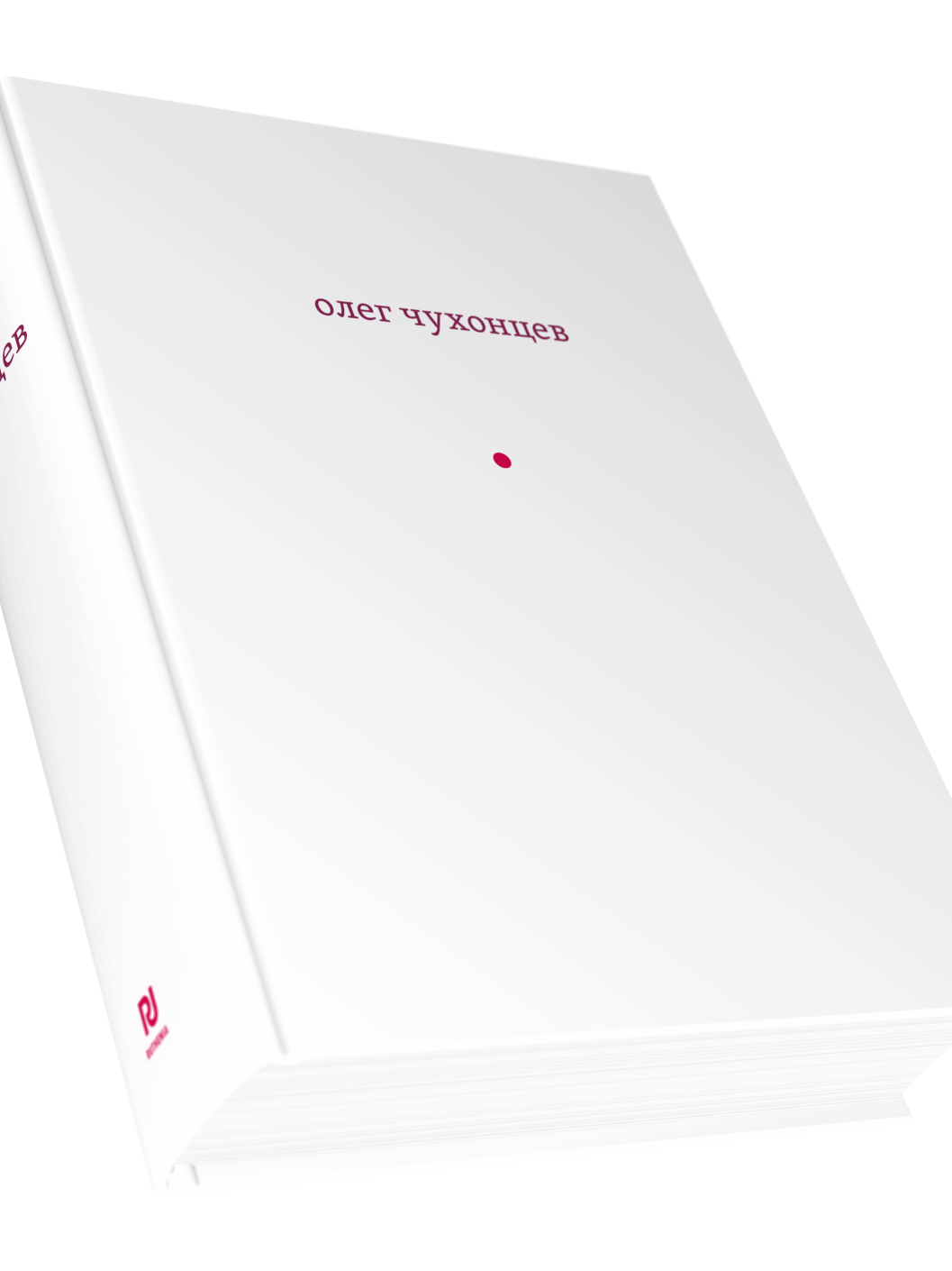
And Sound and Echo
Design and layout for And Sound and Echo - the most complete collection to date of poems by Oleg Chukhontsev, restored from Soviet-era censorship and drawn from across his books. A 600-page volume with a clean serif interior and ink illustrations by Bella Lipshitz.
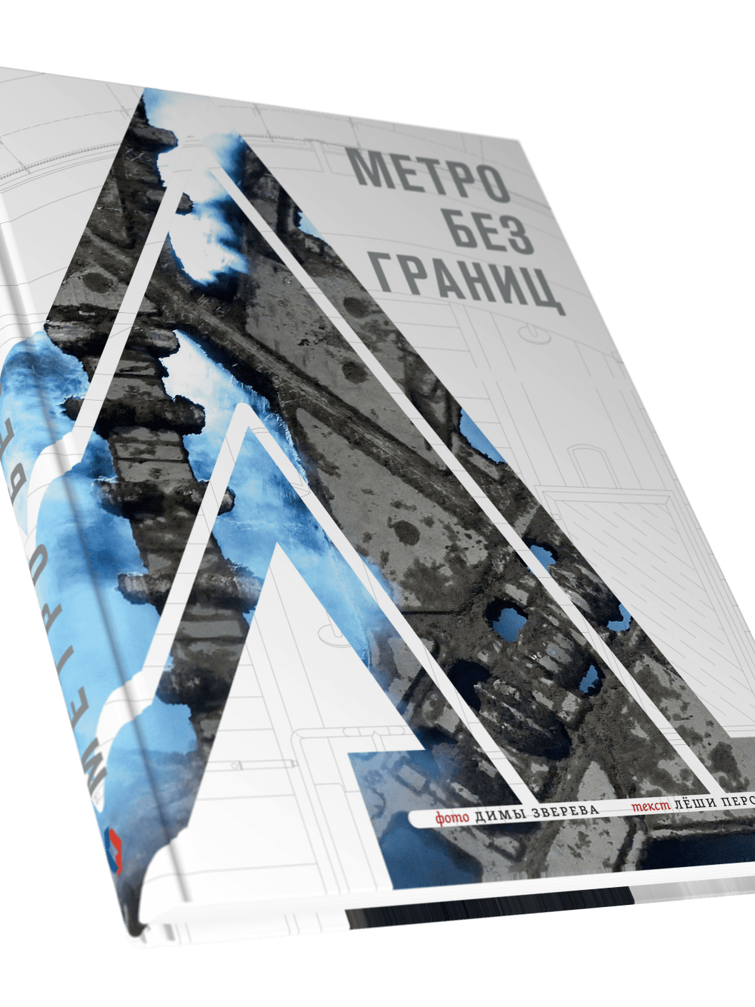
Metro Without Borders
Cover and interior design for Metro Without Borders - a photography book about subway systems, with photos by Dima Zverev and text by Lyosha Persky. Built from raw materials into a print-ready edition, including cover concept, typographic system, photo editing, and layout.
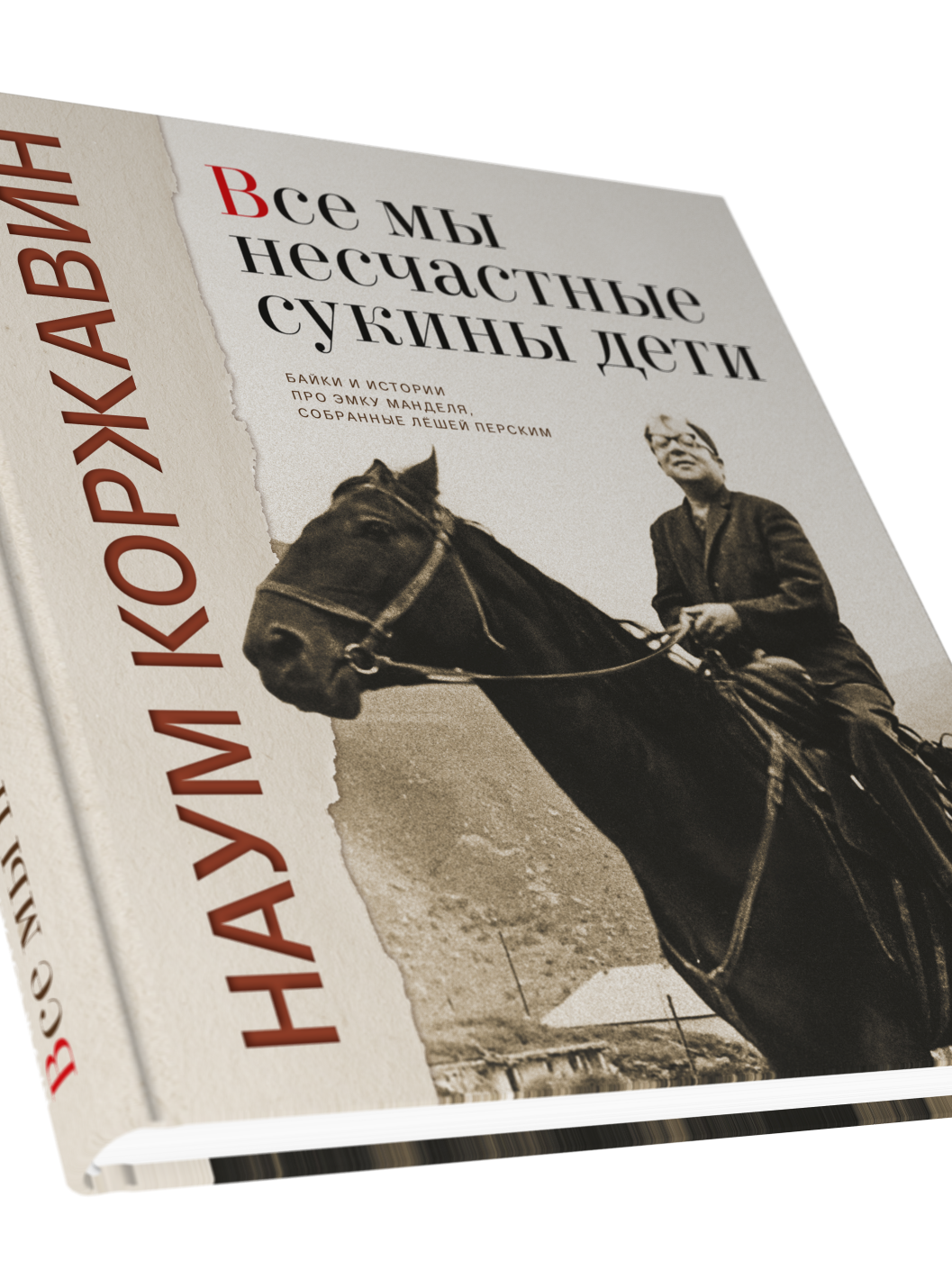

We Are All Miserable Bastards
Cover and interior design for We Are All Miserable Bastards ("Все мы несчастные сукины дети") - a book of stories and anecdotes about poet Naum Korzhavin, put together by Lyosha Persky. Source materials: a Word documents and an unedited photo archive. Output: a complete, print-ready book.
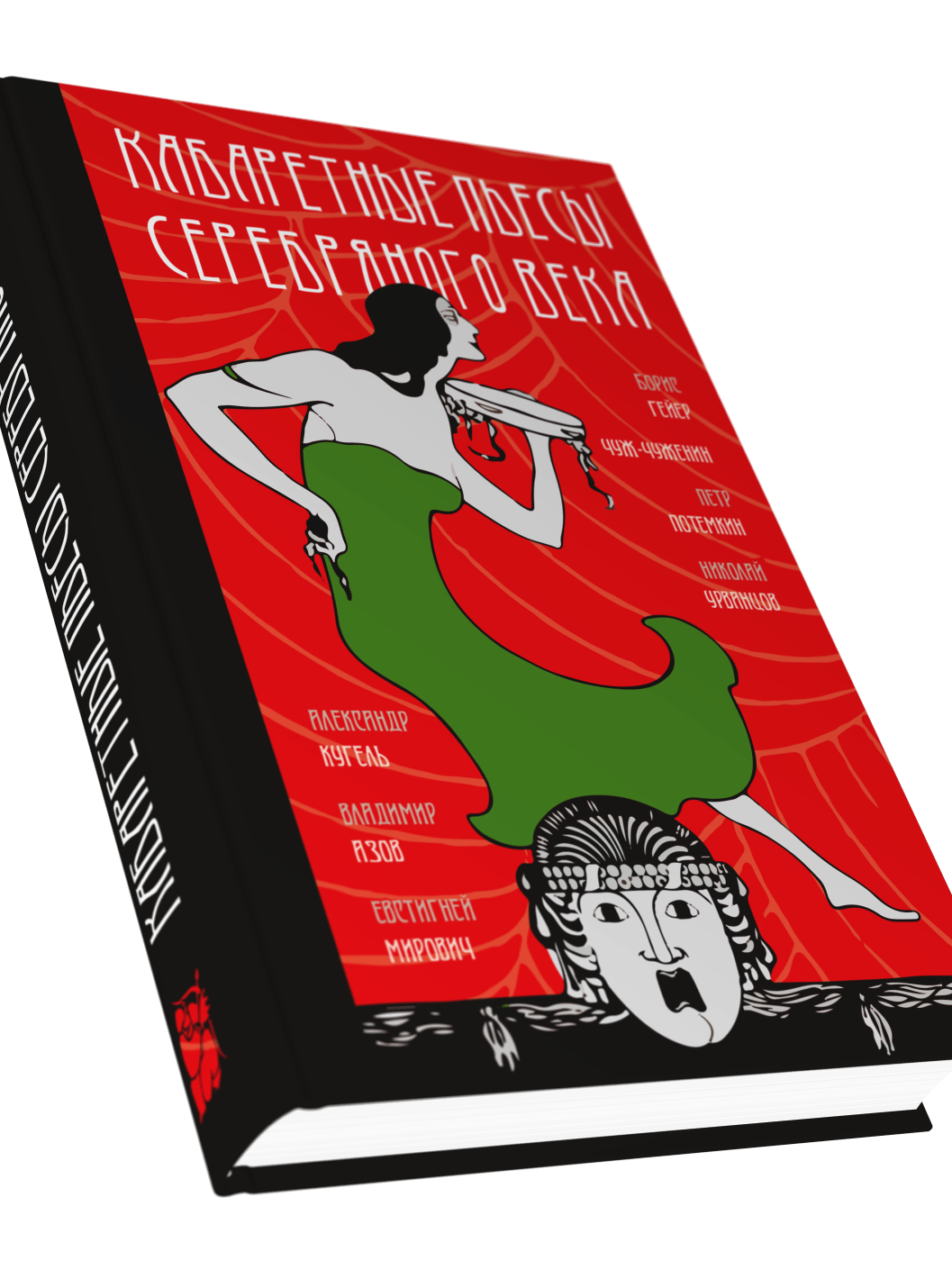
Cabaret Plays of the Silver Age
Design and layout for Cabaret Plays of the Silver Age - an anthology of early 20th-century Russian cabaret drama, compiled by Nora Buks. The Art Nouveau aesthetic runs through the whole book: from the bold illustrated cover to the ornamental patterns and period-style typefaces inside.
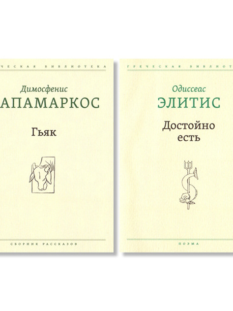
Greek Library
Design and layout for the Greek Library series - four bilingual editions of modern Greek literature in Russian translation, published by OGI. Each volume opens with a Greek-language title spread, followed by the Russian text. Unified series identity with individual color coding per title, craft paper stock, and clean typographic design. The series received the Obraz Knigi (Image of the Book) award.